Cafe// Gallery
Cita-Cita Terbaru???


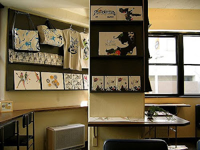
Cafe Pause is a stylish, superb cafe-bar located in Ikebukuro, Tokyo. Ikebukuro is a multiple city center situated in the northwestern corner of the Yamanote Loop Line. The center offers plenty of entertainment, shopping and dinning oppurtunities.
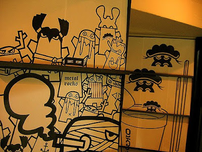
The wonderful design cafe also acting as the office and showcase for designer toys company Roughtoys, and a bit of gallery, as seen with the Shu-Thang Grafix images that adorned the walls.
Cafe Pause features wireless internet and small collection of books, also produces events and parties.
The interior design of the cafe is a mixture of interesting chairs, lounges, sofas, tables and wall amazing features.


Designing an interactive PDF newsletter
Why and How?
Question: How can you disseminate a graphically interesting, beautifully designed small book to a large number of people cheaply?
Answer: Email an interactive PDF.
Almost every computer has Adobe Reader (formerly called Acrobat Reader) and PDFs are widely used as a way to present information with a fixed layout similar to a paper publication.
Question: Why make a PDF newsletter?Answer: It's cheap. Why pay for printing when you can get you readers to do it themselves?
The advantages of PDF publishing over internet publishing are:
No need to worry about browser or platform differences or complying to standards - if you can view a PDF properly in Reader the chances are that everyone else in the world can. You can use any font you want. Vector graphics appear pin sharp at any magnification. You don't need an internet connection to read or print it.
Ah, I hear you say, the web is interactive but PDFs aren't. Wrong again! So you want to make a cool, interactive, screen resolution PDF for emailing to multiple readers? How? Use Adobe InDesign. Obvious, I know, but you wouldn't believe how many people are still trying to do it in Quark.
Format, body copy and image
Landscape, portrait or square. It's your call. I know what I prefer - landscape all the way. The perfect format to go for is A4 in the UK and Letter in the US so it prints out on everybody's printers and a horizontal orientation (on it's side) so it fills the monitor.
No need for spreads so leave Facing Pages unchecked in the New Document dialog box in InDesign. Set some columns and margins if you wish, leave bleed at zero, and let's get going...
Always design for the lowest common denominator. So if your PDF is being read on a 15-inch screen then you will have the type at 12 point at least. Prefer vector graphics to bitmapped images as they will appear sharp and smooth at any magnification on the PDF. Keep images RGB and make them as colourful as possible. And don't be afraid to use large high resolution files for the bitmapped images, they'll be made smaller when the PDF is exported.
Navigation
One of the first things you need to do is to set up a master page. Master pages are used for elements that need to be repeated on multiple pages, for example page numbers, headers and footers.
In a PDF newsletter you may want the newsletter's name repeated top left or right, a "home" button to return to the contents page or a couple of arrows to go to the next or the previous page. All these elements should be put in the master page. Do it here once and it'll be repeated throughout the whole document.
Here we must use InDesign's powerful interactive tools. I find it's better to make buttons with no fill and no stroke. Either choose a button from the toolbar or an empty rectangle and go Object > Interactive > Convert to Button. It works the same way. Do not use an element such as picture or text to make interactive.
Double click your button with the Selection Tool or go Object > Interactive > Button Options... with your button selected and you will get the all important Button Options dialog box.
In this dialog box you will see two tabs. The first is General. Here you have three fields. The first is name, this is for you - give it a name. The second is description, this is for your readers - it is the tip that appears when their mouse hovers over the button. So, depending on what the button is, put in a handy navigational tip like "Go to contents page". Finally, choose Visible for your Visibility in PDF.
The second tab is Behaviours where you will see two drop down menus. On the Event drop down menu, I choose Mouse Up. This is for when people have clicked down on the button and then released, whereas Mouse Down is for when they have only clicked down.
The second drop down menu is the Behaviour - what'll happen when the button is clicked. Here you can select one of 15 different actions.
Select the Behaviour you want, click Add (very important) and OK, and your Behaviour has been set. For Exit, Close, Go To First Page, Go To Last Page, Go To Next Page and Go To Last Page this is all you have to do. For every page you use in your InDesign document and the resulting PDF this interactivity will work beautifully. For navigation and interactivity: Do it in InDesign, don't do it in Acrobat Professional.
Setting Bookmarks
For setting a Button Behaviour to go to a certain page you need to set a page as a Hyperlink in your InDesign document. This is very easy!
Pick the page in the main body of your InDesign document that you want to set as your anchor by double clicking on it in the Pages palette. In the Hyperlink palette (go Window > Interactive > Hyperlink) make a new Hyperlink by selecting New Hyperlink Destination... in the Hyperlink palette and select the zoom. Give your Hyperlink page destination a memorable name.
Then when you are setting the Behaviour of a Button you choose Go To Anchor and select the Hyperlink you require (and the zoom). Add a link to your contents page as a "Home" button on your master page then your readers can click this button on any page of the PDF and return to the contents page. This is a handy and very intuitive navigational element.
Exporting the PDF
When you are exporting the PDF direct from InDesign choose the Smallest File Size preset. In Options, make sure you have Optimize for Fast Web View checked. In Include, make sure you have Hyperlinks and Interactive Elements checked. You may like to check your Bookmarks as well.
In Compression, you may want to Downsample the Color and Greyscale Images to 92ppi in order to keep the file size down but still look nice on a large screen. Keep the quality at Medium (or Low if you want to cut down the size). If size really doesn't matter then bump up the resolution in order to keep the bitmap images nice and crisp.
Hit Export and, there you go! You've made an interactive, screen resolution, printable PDF. Clever!
Addendam, extra bits and stuff I left outDan Brill of Graphic Exchange wrote to me with a few pertinent points on the subject of interactive PDFs. Thanks, Dan!
Dan's first top tip is an embarrassing omission on my part: InDesign's default transparency blend setting is CMYK so it should be changed to RGB. Go Edit > Transparency Blend Space > Document RGB. Otherwise the nice bright RGB colours will come out mucky and muddy on pages where you have used transparent objects.
Dan and his colleague, Lerrick Starr, regularly make all singing and dancing PDFs (or rich media PDFs or rich PDFs) complete with sound, movies, rollovers and pop-up windows. I must say that many of the more interactive and rich media elements have to be set in Acrobat Professional and can't be done properly in InDesign.
The last thing one has to do is to set the initial view. This has to be done in Acrobat Professional.
http://www.graphic-design.com/news/2007/pdf_newsletter.html
E-Newsletters:... before you begin, read this.
This article has been really helpful in helping me plan my e-newsletter for Nour.
http://www.wordbiz.com/archive/pdf_enewsletters.shtml
PDF NEWSLETTERS: retro or a smart move?
Exclusive interview with author, consultant and design guru Roger C. Parker
[Aug. 8, 2003]
By Debbie Weil
Publisher, WordBiz Report
The debate over HTML vs. plain text newsletters is still humming. But not at fever pitch. Without going out on a limb, I'd venture the pendulum has swung towards HTML e-newsletters. They're just plain nicer to read.
But what about PDF newsletters? Sounds retro but a PDF printed out has... heft, tangibility and a look of authority. Some publishers swear by them.
Paid newsletters delivered as PDFs
It's not at all unusual for a paid subscription newsletter to be issued as a PDF.A B2C example is Matthew Bennett's First Class Flyer, an insider's guide to unpublished fares for business and first class airline tickets. Bennett delivers his paid monthly PDF publication as a link inside a text message. A pricey B2B example is IOEnergy's Power Update, daily regional market analysis of the power industry. IOEnergy sends their PDFs as attachments, according to founder Tod Sedgwick. He told me their subscribers, who pay up to $1,000 annually for the daily updates, don't mind. They want to avoid the "extra click" to download the PDF.
(See samples of both these publications below.)
Free e-newsletters in PDF format...are another choice for the reader
"The more choices for people to read your content, the better," Rafat Ali, editor of award-winning PaidContent.org, told me. His daily free e-newsletter is delivered in HTML but with a link at the bottom that "converts" it into a PDF for readers who so desire. You can also read the daily on his site or through a PDA or text-enabled mobile phone.
Note: the PDF is a screenshot of the HTML. It's not a version laid out with Quark, Adobe InDesign or another design program. See links to design software below.
Looks more credible for CXX readers
B2B marketing consultant Kristin Zhivago has another take on PDF e-newsletters. "It comes down to a question of formality. Higher level execs expect a certain amount of formality. If it's not formal, it's not credible," she said. She publishes two newsletters - intermittently - when not too busy as a revenue-generating consultant for big companies. Her Revenue Journal is a PDF aimed at CEOs. She produces her other newsletter, Marketing Technology, in HTML.
Adds value by making publication more tangible
Finally, a well-designed PDF looks like a real publication. It's less ephemeral than a message in your inbox.
Q & A with Roger C. Parker
New Hampshire-based marketing & design consultant Roger C. Parker is the author of best-selling Looking Good in Print: A Guide to Basic Design for Desktop Publishing, just released in its 5th edition. Remember when desktop publishing was all the rage back in the 80s? Roger was one of the original gurus. He's written 31 other books including several Dummies' guides. He's the editor of three PDF e-newsletters: Guerrilla Marketing & Design, Published & Profitable and One-Page Editor. All are based on his One-Page Newsletter concept. Links to his websites and sample newsletters below.
WordBiz:Why do you use the PDF format for your newsletters?
Roger: All media represents a compromise between quantity and quality.
I prefer to go the "quality" direction and make a big impression - through design - on those who make the effort to open my PDF rather than have a less memorable, harder-to-read text or HTML newsletter.
WordBiz:What's wrong with HTML newsletters?
Roger:They often frustrate me: they require me to resize my browser window, they often don't save properly, and they usually don't print properly. Page breaks never work out and the pages aren't numbered.
I know that many of my newsletter recipients may not always open my PDF newsletter the day it arrives, but I have a lot of anecdotal information that many do save my PDF newsletters in a dedicated folder and print each issue for reader at home or on the road.
WordBiz:What about text newsletters?
Roger:They all look the same, and many of them I find downright ugly. There's no benefit to seeing rows of repeated exclamation points or other symbols.
The lack of control over line spacing makes them difficult to read. They don't print particularly well. Often, when printed, they take up more space than they should because of their short lines.
WordBiz:Tell me more about the advantages of publishing in PDF
Roger:I find it very helpful to have to write to fill available space. When formatted, my One-Page Newsletters contain space for between 625 and 650 words. In order to get everything in to my newsletter, I have to carefully self-edit.
This monthly self-editing for length is a challenge but it improves the quality of my writing in a very painless way. I'm writing shorter sentences and paragraphs, using shorter words.
There's a temptation to ramble when you there are no limits on the space you can take up.
WordBiz:Any other PDF benefits?
Roger:Design is a marketing tool. It separates me and it brands my newsletter.
Because I use a PDF format created in Adobe InDesign, I have total control over typeface, type size, line length, and line spacing.
I have control over hyphenation. I have control over paragraph spacing.
I have dozens of quotes from readers saying they like my "quick read" newsletter. Many say it's the easiest and fastest reading newsletter they receive. They can read it in about 2 1/2 minutes.
When driving, they can read it on the way home, when they stop at traffic lights.
The PDF enforces brevity and quick, easy reading in these busy times.
WordBiz:How often do you send out your newsletter?
Roger:Monthly, although if I come up with a great idea, or a special promotion, I sometimes send two issues a month.
WordBiz:Why monthly?
Roger:The one-page monthly format is the best way to keep in touch with clients. Newsletter marketing typically fails because people send a four-page bimonthly newsletter or an eight-page quarterly newsletter.
4-page or 8-page newsletters are exponentially more difficult to produce than a one-pager.
WordBiz:What's your content formula?
Roger: Content is strictly educational. No promotion, no advertising. Topics are timeless, stressing the "how to" details that business schools forget to teach.
For example, each issue of Guerrilla Marketing & Design discusses a single, often-overlooked design or marketing topic and shows how to maximize it.
Typical topics include:
- E-mail subject lines and signatures
- Importance of subheads and formatting tips
- Building your Marketing Funnel
- Web site Incentives
- Education-based Marketing
Promotional messages - upcoming teleclasses or new e-books - are described in the covering e-mail the PDF is attached to.
Because the topics are educational and timeless, my current issues are as valid today as they were first sent.
This permits me to sell yearly compilations of the newsletters.
My "Best of Guerrilla Marketing & Design, Volume l," for example, contains 25 issues in a spiral-bound format.
Together, these printed issues can bring a busy marketer up to speed without reading dozens of individual books.
More important, the compendium of my back issues is a perfect credibility builder/leave behind when I meet a new client.
WordBiz:How many topics in each issue? I tell my clients they can have no more than five topics in a table of contents for any given issue of their newsletter.
Roger:That's too many! The key to success is to focus each One-Page Newsletter on a single topic.
This focuses both writer and reader. The one-topic-per-month format is essential to my concept of the One-Page Newsletter.
The minute you try to treat two subjects, you're making your life harder and you're losing your focus--and readers like the focus of a one-topic-per-month feature.
Writing becomes easier over time, because the one-topic per-month 625-650 word count creates a rhythm that makes each issue easy to write and easy to read.
WordBiz:Anything you'd like to add?
Roger:Never before has technology been so friendly to writers. Writers used to be pawns of publishers.
Now, with PDFs, print on demand, and low-cost telephone bridge line rentals, writers can be publishers and keep more of the profit for themselves.
WordBiz:Roger, thanks for your time. I especially like your point that writing for a PDF newsletter with a defined layout forces you to adapt to the space and write "shorter."
USEFUL LINKS: Roger C. Parker
Download a sample of three of Roger Parker's One-Page E-newsletters (PDF)Explore his Web sites:NewEntrepreneur.com
OnePageNewsletters.com
---------------
http://onepagenewsletters.com/PDF/58PresentingwithAcrobat.pdf
http://www.onepagenewsletters.com/PDF/12DesignMistakes.pdf
http://www.onepagenewsletters.com/PDF/061PageNewsletter.pdf
http://www.mc.uky.edu/pharmacistcare/newsletter1205.pdf
Subscribe to:
Posts (Atom)


